top of page
Search

Descision 203D

  • oliviawatkins0
  • Nov 8, 2016
  • 1 min read

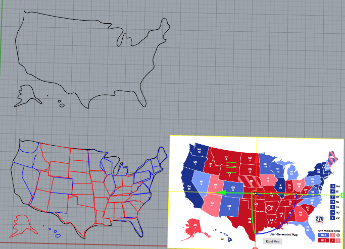
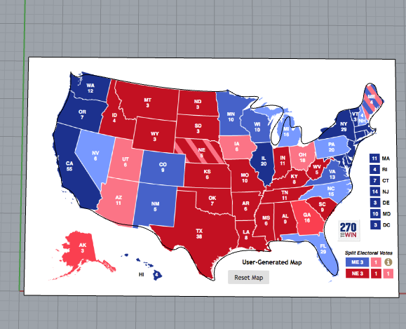
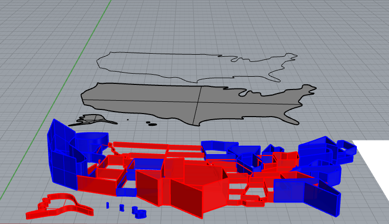
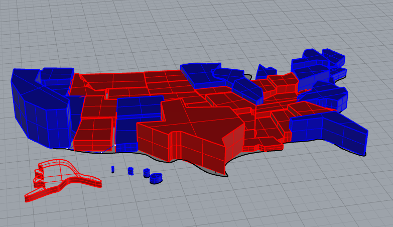
Today while getting excited for the election I was looking at some predictive electoral maps online trying to sooth my nerves and I thought that would be perfect for this "Data Sculpting" assignment. I always have trouble understanding how the electoral college works ( I think most Americans do) so I wanted to visualize it in a better way. Instead of reinterpreting a pie chart I decided on looking at which states had the most votes in the electoral college and making them greater in hight respectively.

It works best interactively as you move around the piece you can see the dimensionality better than in the pictures
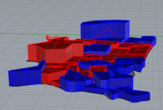
.


Recent Posts

See All

RECENT POSTS

FEATURED POSTS

Check back soon
Once posts are published, you’ll see them here.

FOLLOW US

  • Grey Facebook Icon
  • Grey Twitter Icon
  • Grey Instagram Icon
  • Grey Google+ Icon
  • Grey Pinterest Icon

ABOUT Olivia Watkins

I am a Classical Studies major and "Technology,Arts and Media" minor at the University of Colorado, Boulder graduating in 2017.  I love to travel and explore all the many places our beautiful world has to offer, but my home base is currently in Brooklyn, New York. I am an avid reader, hiker and movie goer. I pride myself on having an unique world view due to my multiracial upbringing and vast imagination!

SUBSCRIBE 

bottom of page